
Retrica’s new Halftone preset set transforms your everyday photos into bold, graphic artwork — inspired by the texture of ink on paper.
There’s something irresistible about a halftone image. The tiny dots, the graphic contrast, the way a photograph starts to look less like a snapshot and more like a print pulled from a vintage magazine. It’s a visual language that’s been around for over a century — and it still turns heads.
With Retrica’s new Halftone preset set, you can apply this effect instantly, right from your camera or gallery. Whether you’re drawn to the loud, bold energy of CRIMSON or the quiet texture of the gray halftone presets, there’s something here for every kind of photo.
Here’s everything you need to know about halftone photography in Retrica — what it is, how it works, and how to get the best results.
What Is a Halftone Effect?
Before screens and digital printing, halftone was a practical solution to a technical problem. To reproduce photographs in newspapers and magazines, printers couldn’t just lay down continuous shades of gray or color — they could only print solid dots of ink. So they broke every image down into a grid of tiny dots. Dots packed closely together appeared dark. Dots spaced further apart appeared light. From a distance, the eye blended them into the illusion of a full image.
The result was something that looked imperfect, textured, and unmistakably made by hand — in the best possible way.
Pop artists like Roy Lichtenstein turned halftone into an aesthetic of its own in the 1960s, blowing the dots up to a massive scale and making them the subject rather than the process. Punk zines, newspaper front pages, concert posters — halftone became the visual shorthand for something raw, urgent, and real.
Today, halftone is experiencing a major resurgence in design and photography. It sits at the intersection of analog and digital, vintage and contemporary — and that tension is exactly what makes it so compelling.
Retrica’s Interpretation of Halftone
Retrica has always been about more than just filters. It’s about giving you a different way to see.
With the Halftone preset set, Retrica takes the classic halftone technique and reimagines it for the way we actually take photos today — quickly, on a phone, in the middle of everyday life. The result isn’t a simulation of old printing technology. It’s a new kind of image: one that feels bold, graphic, and intentional, even when the moment itself was spontaneous.
Every photo you shoot becomes a field of dots. Strong shapes become graphic silhouettes. Everyday scenes take on the weight of a poster. Quiet landscapes become something closer to a drawing than a photograph.
There are two distinct directions in the Halftone set: the vivid, high-contrast red halftone (CRIMSON) and the soft, minimal gray halftone presets — CINEINK for a lighter, airier feel, and MONOINK for a deeper, darker tone. Each creates a different mood — but all three share the same core quality: they make photos look considered, even when they weren’t.
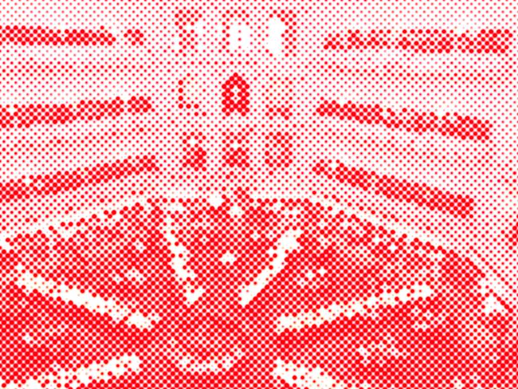
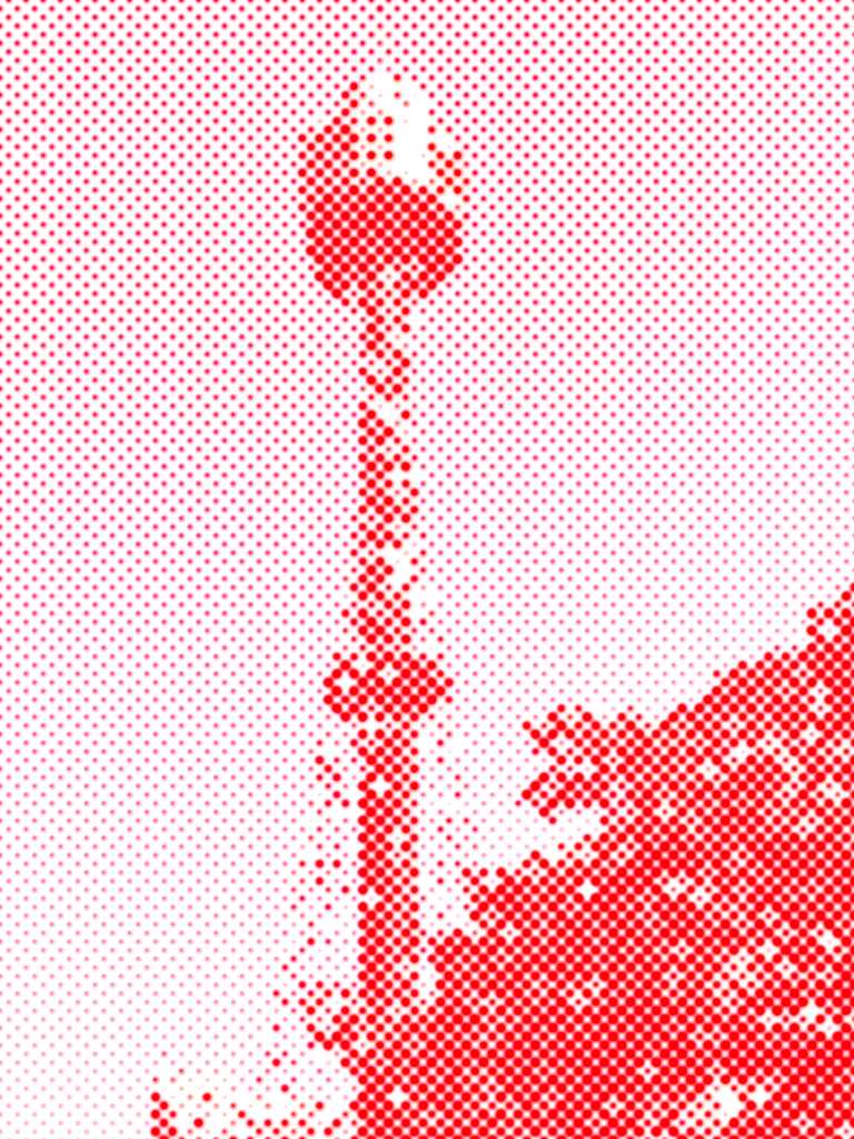
CRIMSON: Turn Your Photo Into a Bold Red Halftone Artwork
The standout preset in the Halftone set is CRIMSON — and it earns the name.
CRIMSON converts your photo into a two-tone image: pure white and vivid red, broken down into a dense field of halftone dots. The effect is striking. Busy scenes become graphic compositions. Familiar subjects — a tower, a meal on a table, an intersection seen from above — suddenly look like they belong on a poster or the cover of a design magazine.
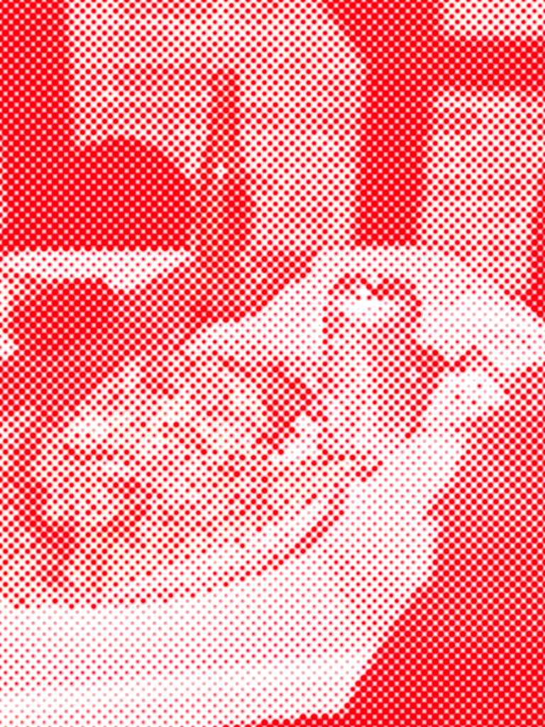
When to use CRIMSON:
CRIMSON thrives on contrast and strong shapes. It works best when your subject has clear, defined edges — architecture, objects, people in a well-lit scene. Avoid using it on photos that are very dark overall; the dots lose definition when shadows dominate too much of the frame.
For the best results, shoot slightly overexposed (brighten your camera view before shooting), so the lighter areas of the halftone have room to breathe. The interplay between the dense red dots and the white negative space is where the magic happens.
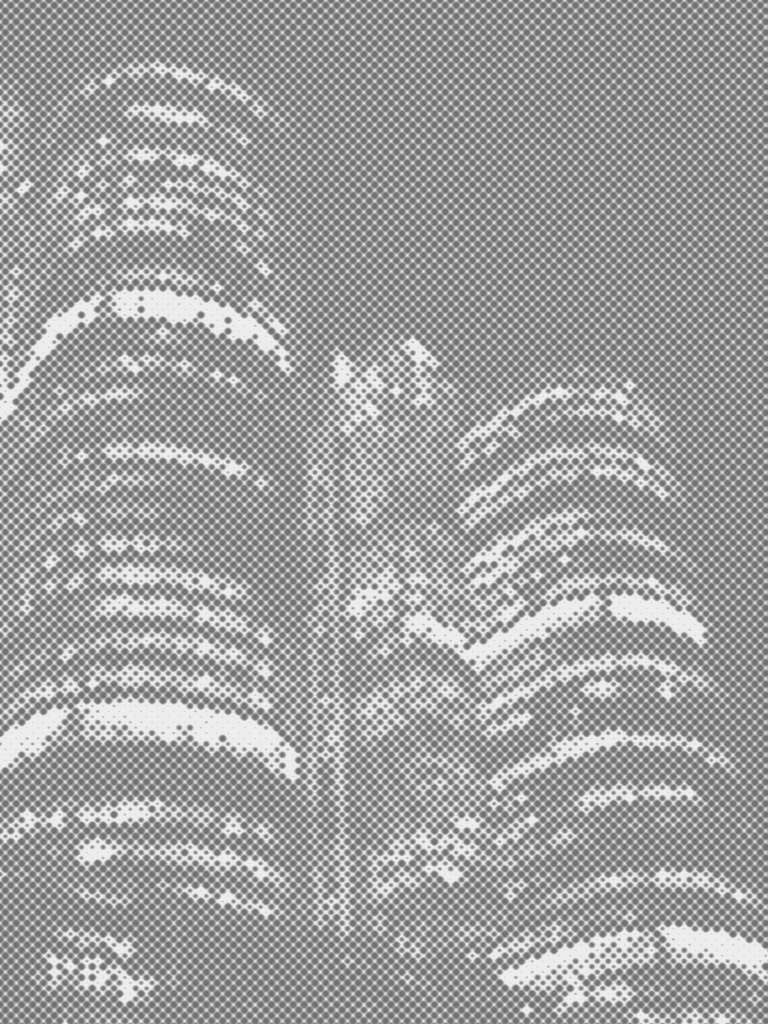
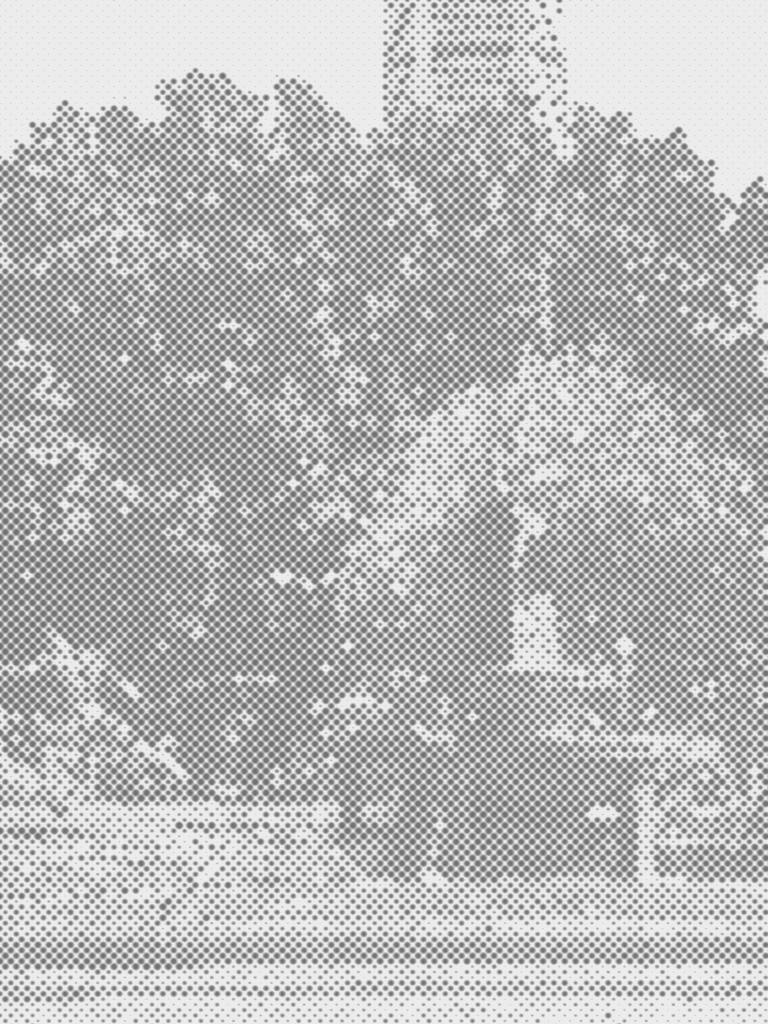
CINEINK & MONOINK: Quiet, Minimal, Timeless
If CRIMSON is loud, CINEINK is a deliberate exhale.
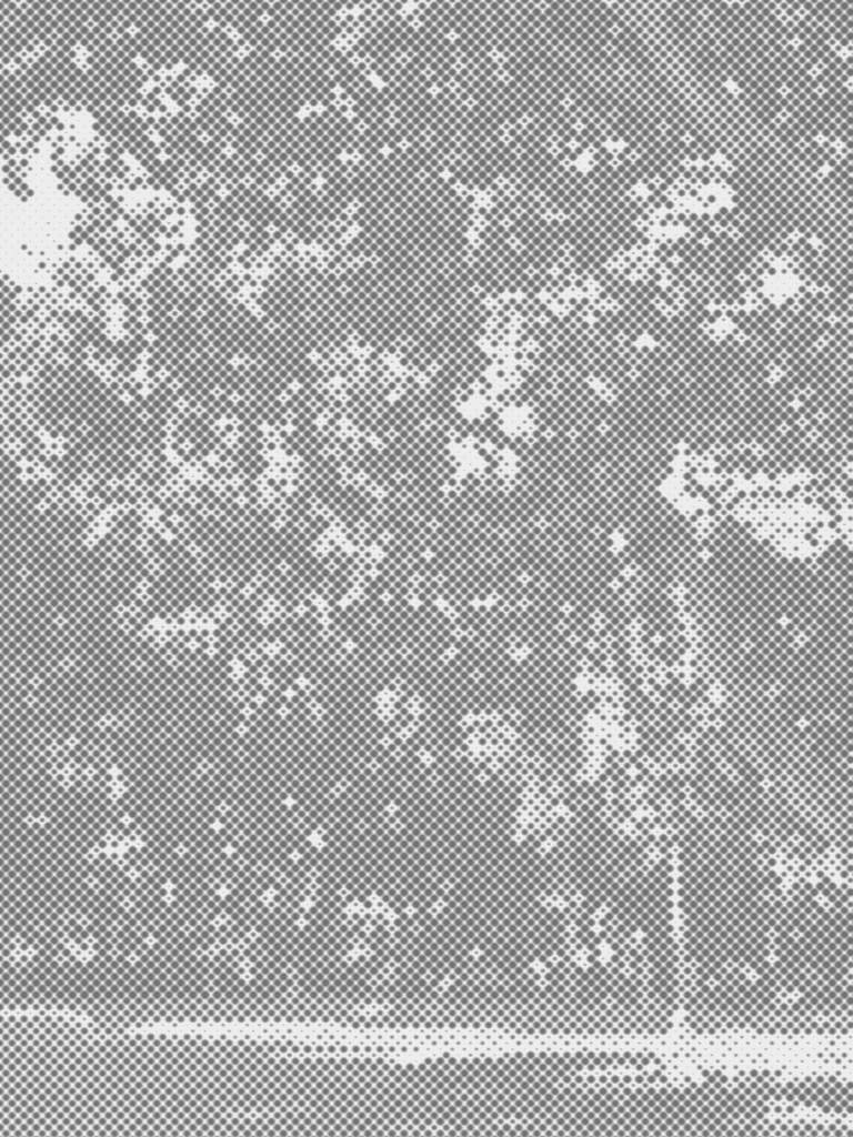
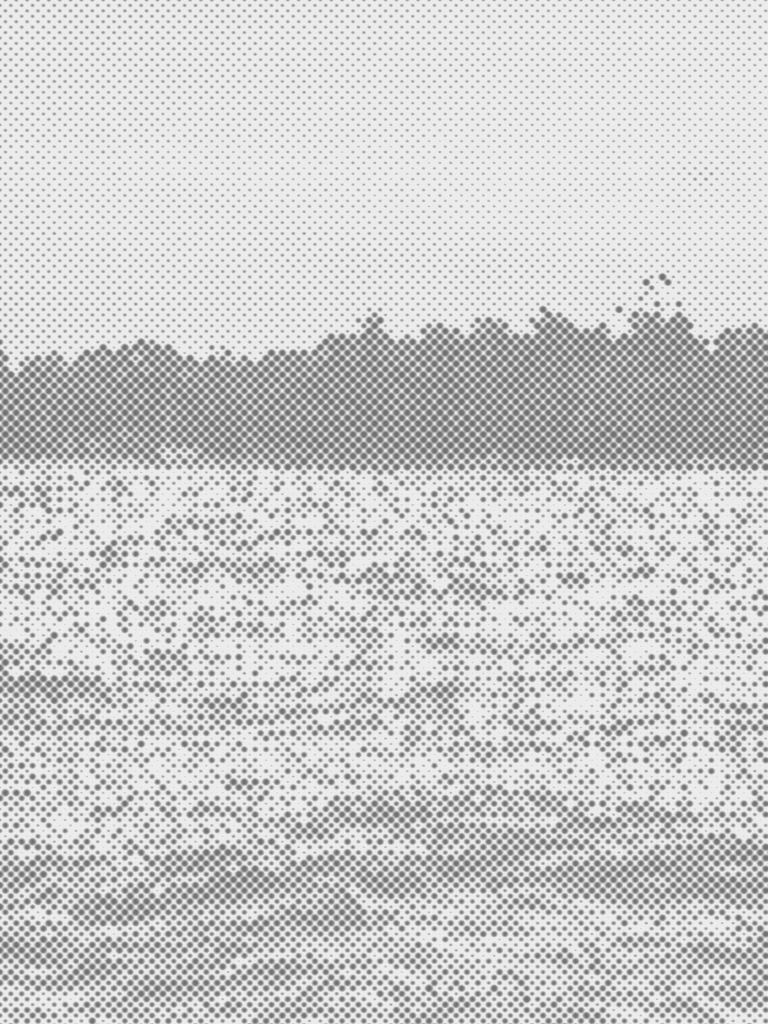
These presets strip a photo down to its essential shapes — rendered in soft gray dots against white. CINEINK uses a lighter gray, giving photos an airy, almost ghostly quality — like a photo clipped from an old book and kept somewhere safe. MONOINK goes deeper, with a darker, denser gray that adds weight and shadow, closer to a graphite sketch or a darkroom print.
They’re well-suited for moments that don’t need to compete for attention. A landscape. A tree. A quiet street. A stretch of water with no horizon.
Nature
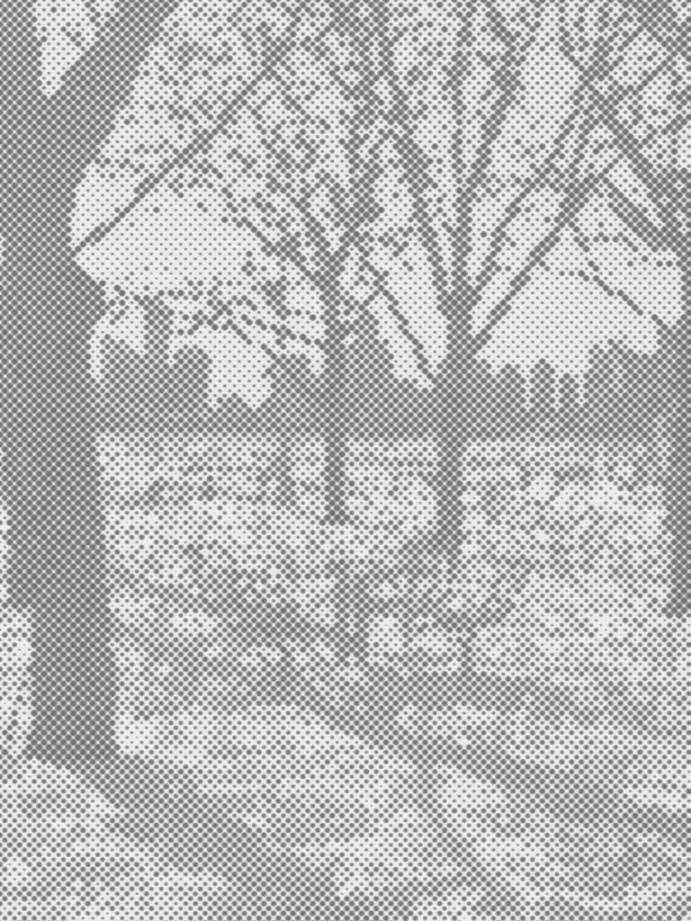
Both CINEINK and MONOINK work particularly well with natural scenes because nature is already full of texture. A halftone layer doesn’t fight with that complexity — it translates it into something quieter, more unified. Reach for CINEINK when you want the scene to feel light and open; switch to MONOINK when you want more presence and depth.
The City
Urban photography takes on a different quality with halftone. Buildings, angles, and the geometry of city life are naturally graphic subjects — and CINEINK and MONOINK respond to that geometry in interesting ways.
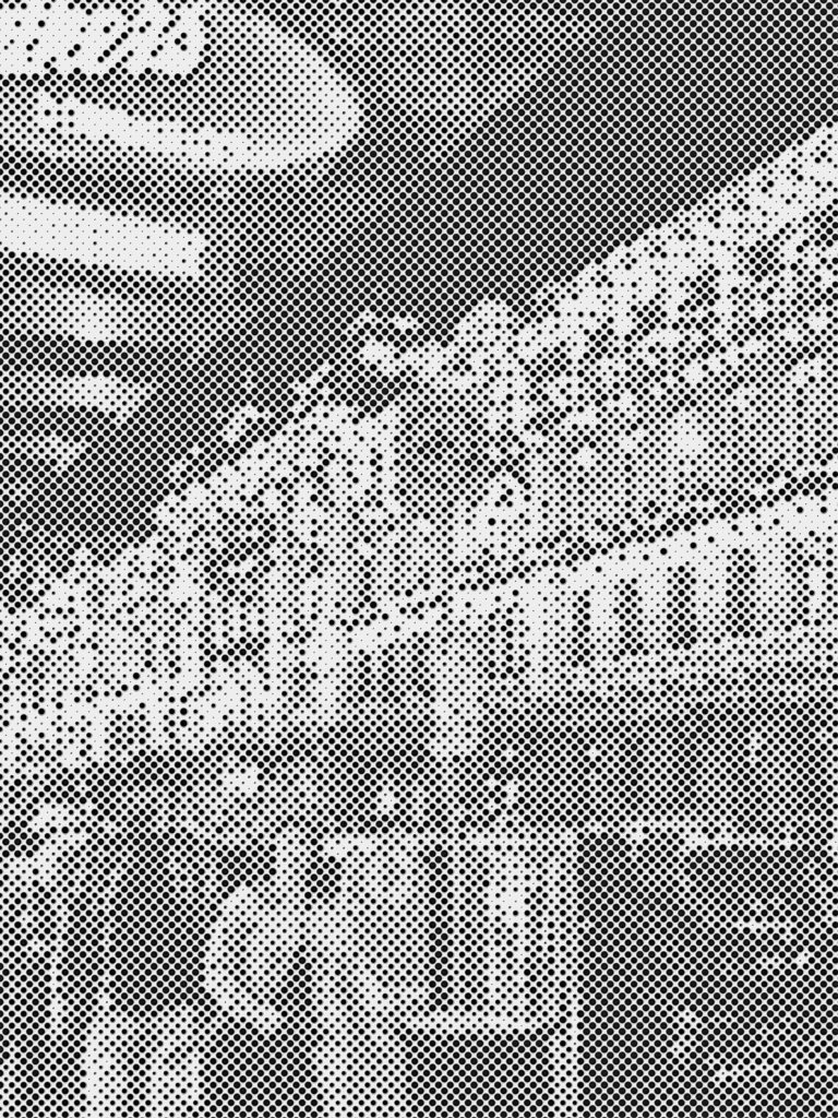
For city photography, halftone adds a kind of editorial quality. Photos feel less casual, more composed — like they were taken with intention. The gray tones also remove the distraction of color, letting the structure of the scene do all the work. CINEINK keeps things light and airy — good for open streetscapes and parks. MONOINK, with its darker tone, suits dramatic architecture and scenes where shadow and structure dominate.
Go Further with Retrica Studio: Custom Halftone Settings
Retrica’s built-in halftone presets are designed to be instant — apply and shoot. But if you want to go deeper and create your own halftone look, Retrica Studio gives you full control over the effect with four adjustable parameters:
Strength Controls how intense the halftone effect is. A low strength setting creates a subtle texture — the dots are barely visible, giving a gentle grain-like quality. Pushed higher, the dots become prominent and graphic. For CRIMSON-style boldness, push strength toward the maximum.
Radius Adjusts the size of the individual dots. Smaller dots create a finer, more detailed texture — good for portraits or images where you still want to read the detail of the subject. Larger dots create a more abstract, pop-art quality where the dots themselves become part of the composition.
Color Changes the ink color of the dots. The CRIMSON preset uses a deep, saturated red — but you can experiment with other colors to create entirely different moods. A blue halftone reads cold and cinematic. Black and white feels editorial. A warm amber halftone has a vintage print quality.
Background Sets the color of the lighter areas between the dots. White is the classic choice — it creates maximum contrast and that clean, printed-page look. But a slightly off-white or cream background softens the effect and gives it a more tactile, paper-like feel.
These four parameters give you the ability to create halftone results that are entirely your own — from barely-there texture to fully graphic artwork.
Tips for Shooting Great Halftone Photos
Halftone isn’t a filter you apply and forget. Like any strong visual effect, it works best when you’re thinking about it before you press the shutter.
Look for contrast. Halftone is a two-tone effect at heart. Photos that already have strong contrast — light areas and dark areas, clear foreground and background — translate most powerfully into halftone. Flat, evenly-lit photos tend to produce muddy results.
Shoot slightly brighter. Because halftone compresses your image into dots, shadow detail often disappears. Increasing your exposure before shooting (or brightening the image afterward) keeps the lighter, detail-rich areas of the halftone visible.
Think in shapes, not details. Halftone dissolves fine details into dots. What survives is the silhouette and structure of your subject. Before shooting, ask yourself: does this scene have a strong overall shape? A recognizable form that reads from a distance? If yes, halftone will serve it well.
Use architectural subjects for CRIMSON. Vertical lines, geometric patterns, and repetitive structures — bridges, towers, intersections, building facades — translate beautifully into red halftone because their structure becomes graphic.
Use wide, open scenes for CINEINK and MONOINK. Landscapes, parks, and any scene with open sky or water give the gray halftone dots space to breathe. The quieter the scene, the more the texture becomes the focus. Choose CINEINK for a delicate, faded feel and MONOINK when you want more contrast and drama.
Why Halftone Is Worth Exploring Right Now
Scroll through any photo-heavy platform and everything starts to look the same. Ultra-saturated, hyper-real, algorithmically optimized for brightness and warmth. It’s easy to understand why — these are settings that get engagement.
But there’s also a growing appetite for something different. Something with texture, imperfection, and a visual language that doesn’t come pre-optimized. Halftone is one of those aesthetics.
Photos shot with Retrica’s Halftone presets don’t look like phone photos. They look like something made — a print, a poster, an image that somebody thought about. And in a feed full of glossy, filter-smooth images, that texture stands out.
Try Retrica’s Halftone Presets
The Halftone preset set — including CRIMSON, CINEINK, and MONOINK — is available now in Retrica.
You can apply any preset directly in the camera before you shoot, or use it to transform photos from your gallery. If you want to customize the effect, open Retrica Studio and adjust the strength, radius, color, and background to make the halftone your own.
Download Retrica and explore the Halftone set — along with hundreds of other presets — on iOS and Android.
And if you want to stay updated on new presets, camera tips, and visual inspiration from the Retrica team, check out the Discover section inside the app.
All photos in this post were captured using Retrica’s Halftone presets.

Leave a comment